20 Best Anime Characters for Your Desk Setup
June 30, 2026
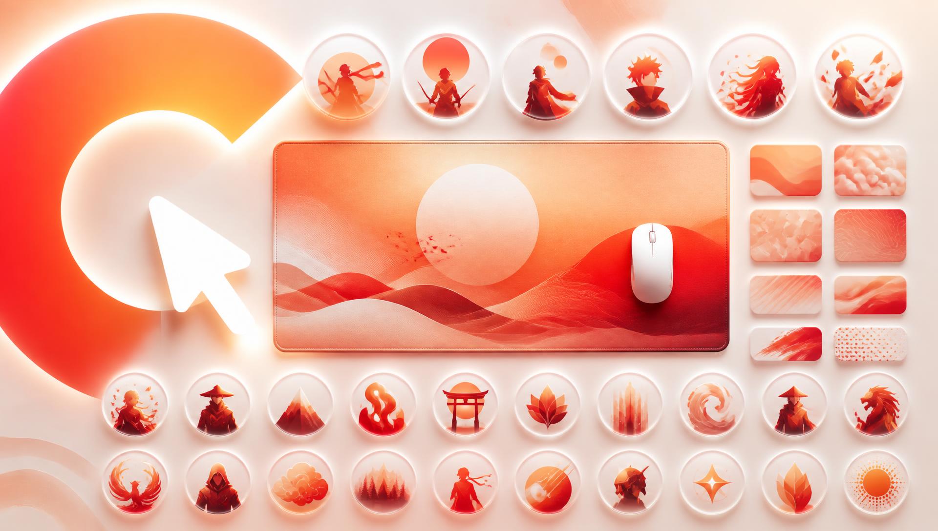
The best anime characters for your desk setup aren't necessarily your favourites in the show — they're the ones whose silhouette, palette, and contrast actually read at arm's length across a wide deskmat. This list ranks 20 widely recognised anime archetypes by design suitability: what makes their visual language work on a 900mm-wide pad, how to compose them, and a prompt you can adapt in the studio.
This isn't a merch review and it isn't ranking "best character" in a vacuum — it's ranking which visual identities translate best into a desk-scale print. A character with a strong, simple silhouette and a two-or-three colour identity will always outperform a busy, detail-heavy design at this size, regardless of popularity.
Before diving in: none of the prompts below name copyrighted franchise characters to copy exactly. They're written as archetypes — a specific class of character concept, pose, and palette — so you get a design inspired by the aesthetic rather than a direct reproduction. More on why that matters in the copyright section at the end.
Why silhouette and palette matter more than detail
A deskmat is viewed from 60–70cm away, often with a keyboard sitting across the middle of it. Fine detail disappears at that distance and under that occlusion. What survives is:
- Silhouette — can you recognise the pose and shape from across the room?
- Palette — two or three colours that read instantly, rather than a busy, multi-tone scene.
- Contrast — a bright or dark subject against a calmer field, so the eye has somewhere to land.
Every entry below is picked because it naturally produces strong silhouette, restrained palette, and clear contrast — the three things that make an anime character actually work as a wide-format print rather than just a nice picture.
The ranked 20
1. The white-haired power-type with an eye motif
Stark white or silver hair against a saturated background colour is one of the highest-contrast combinations available, and an eye or energy motif gives you a strong focal point without needing a full-body pose. Composition: subject anchored right third, energy effect sweeping left, deep navy or violet field filling the rest. Prompt idea: "White-haired figure with glowing violet eye energy, cinematic wide shot, anchored right third, deep navy and violet swirl filling the left two thirds, dramatic rim light, no text."
2. The golden-transformation shonen lead
Gold-and-red or gold-and-white palettes read instantly from a distance and carry a built-in sense of motion. Composition: dynamic diagonal pose, lower-left anchor, radiating light streaks filling the upper right. Prompt idea: "Golden-aura martial artist mid-powerup, dynamic diagonal pose anchored lower-left, radiating light streaks sweeping upper-right, palette of gold, crimson and white, no text."
3. The cursed-energy sorcerer in dark tones
Black, magenta, and deep purple against a near-black field is dramatic and doesn't compete with anything else on the desk. Composition: subject small and precise on the far side, vast dark negative space carrying the mood. Prompt idea: "Dark-robed sorcerer channeling malevolent purple energy, small and precise on the right edge, vast near-black field filling the left, no text."
4. The flame-based Hashira archetype
Warm oranges and reds against a cooler background create strong colour contrast and feel energetic without needing action linework. Composition: flame effect anchored left, cool ash-grey or smoke atmosphere on the right. Prompt idea: "Flame-wielding swordsman, warm ember and crimson palette, anchored left third, cool grey smoke atmosphere filling the right two thirds, no text."
5. The stoic captain in ODM/tactical gear
Muted greens, browns, and greys with a single sharp silhouette work well for a more restrained, mature desk aesthetic. Composition: mid-air or mid-motion pose, off-centre, open sky or fog filling the remainder. Prompt idea: "Tactical-gear soldier mid-leap through fog, silhouette anchored right third, muted olive and slate palette, open grey sky left, no text."
6. The Susanoo/spirit-guardian overlay
A translucent giant spirit form behind a smaller human figure gives a natural two-layer composition with automatic depth. Composition: small human figure lower third, massive translucent spirit silhouette filling the upper two thirds. Prompt idea: "Small warrior standing before a towering translucent spectral guardian, palette of deep amber and charcoal, figure anchored bottom-centre, no text."
7. The devil-hybrid antihero
High-contrast red-and-black with a jagged, aggressive silhouette suits a grittier, less polished aesthetic. Composition: close-cropped upper body, anchored one side, chainsaw or claw motif kept simple. Prompt idea: "Red-and-black devil-hybrid figure, jagged aggressive silhouette anchored left third, gritty urban backdrop faded right, no text."
8. The demon-slayer sibling in soft pastels
Soft pink, coral, and cream palettes stand out against the more common dark, high-contrast options on this list and suit a cozier desk. Composition: gentle pose, off-centre, floral or bamboo motif filling negative space rather than another figure. Prompt idea: "Kimono-clad figure with soft pink and bamboo-green colouring, gentle pose anchored right third, cream negative space left, no text."
9. The green-haired swordsman archetype
A simple two-tone green-and-white palette with a katana silhouette is instantly recognisable and easy to keep clean at scale. Composition: side profile, weapon drawn, anchored to one edge with open dojo or bamboo backdrop. Prompt idea: "Green-haired swordsman in a three-sword stance, side profile anchored right, bamboo grove fading into mist left, no text."
10. The disciplined tactician with a red scarf
A single strong colour accent — red scarf, red eyes — against a monochrome uniform is a classic high-recognition, low-complexity design. Composition: close three-quarter portrait, anchored one side, scarf trailing into negative space. Prompt idea: "Stoic soldier with a trailing red scarf, close three-quarter portrait anchored left third, scarf motion trailing right, muted grey backdrop, no text."
11. The dual-elemental hero (fire/ice split)
A literal colour-split composition (half warm, half cool) is a built-in design gimmick that reads instantly as a concept, not just a character. Composition: vertical or diagonal split down the pad, warm palette one side, cool the other. Prompt idea: "Figure with one half engulfed in flame and one half in ice, diagonal composition splitting warm crimson and cool cyan-restrained tones, no text."
12. The orange-haired shonen protagonist
High-saturation orange hair against a simpler backdrop is a reliable, punchy focal point that doesn't need an elaborate scene around it. Composition: action pose anchored one third, simple gradient sky filling the rest. Prompt idea: "Orange-haired fighter mid-punch, anchored left third, warm gradient sky filling the right, no text."
13. The lightning-based assassin
Electric blue or violet lightning against a dark field creates dramatic linework that reads as pure energy rather than needing a detailed figure. Composition: small silhouette, large jagged lightning motif filling most of the frame. Prompt idea: "Fast assassin silhouette trailing violet lightning, small figure lower-right, jagged energy streaks filling the rest, near-black field, no text."
14. The regal, multi-armed deity archetype
Elaborate but symmetrical designs work well when the palette stays tight — usually deep purple, gold, and white. Composition: centred but small, ornate detail radiating outward, generous open field at the pad's ends. Prompt idea: "Regal multi-armed deity figure, ornate gold and violet detailing, centred and compact with open dark field on both sides, no text."
15. The masked, chaotic trickster
A stark palette of red, white, and black with a mask motif is graphically bold and works even in a minimal, near-abstract composition. Composition: close-up on the mask/face only, rest of the pad left as flat negative space. Prompt idea: "Close-up of a stylised jester mask, red white and black palette, anchored right third, flat charcoal field left, no text."
16. The ninja-village underdog
Bright orange-and-blue is one of the most recognisable colour identities in the genre and reads well even at a distance. Composition: running or leaping pose, diagonal motion line, anchored to one side. Prompt idea: "Orange-and-blue clad ninja mid-sprint, diagonal motion streaks, anchored left third, open dusk sky right, no text."
17. The green-costumed hero-in-training
Bold primary green against a simple sky or cityscape keeps this archetype clean and legible even in a minimal composition. Composition: determined stance, anchored one third, city skyline silhouette filling the rest. Prompt idea: "Green-costumed hero in a determined stance, anchored right third, muted city skyline silhouette left, no text."
18. The pale, minimalist android/pilot archetype
Pale blue and white with almost no colour variation suits a cold, minimal desk aesthetic and prints extremely cleanly. Composition: still, symmetrical pose, generous flat negative space, subtle cool gradient. Prompt idea: "Pale figure in a minimalist pilot suit, still symmetrical pose, anchored centre-left, flat cool blue-grey gradient filling the rest, no text."
19. The card-playing chaotic jester-type
Diamond and star motifs plus a stretched, exaggerated pose create graphic interest without needing a busy background. Composition: exaggerated pose anchored one edge, playing-card motifs scattered as negative-space texture. Prompt idea: "Chaotic jester-type figure in an exaggerated pose, anchored left third, faint scattered card motifs across a muted red field, no text."
20. The iconic yellow creature-companion
Flat, bright yellow against almost any background is the single highest-contrast, most universally recognisable option on this list, and it works even as a small, simple mascot-style composition. Composition: small and centred or off to one side, huge flat colour field doing the rest of the work. Prompt idea: "Small round yellow creature character, simple flat rendering, anchored right third, plain pastel field filling the rest, no text."
Character archetype vs pad composition at a glance
| Archetype | Palette behaviour on cloth | Best pad placement | Composition risk |
|---|---|---|---|
| High-contrast action lead | Saturated primaries hold up well | Left third, facing centre | Busy effects under the mouse zone |
| Calm/slice-of-life character | Soft pastels can wash out | Right third, large negative space | Low contrast against a light base |
| Dark/anti-hero | Deep blacks flatten into one mass | Centre-right, rim-lit | Losing detail in shadow areas |
| Mecha/armoured | Hard edges and metal reads sharp | Full-width panoramic | Thin panel lines vanishing at scale |
| Elemental/magic user | Neons shift toward duller tones | Centre with glow spilling outward | Over-bright glow banding |
| Ensemble/group shot | Mixed palettes compete | Spread across the full width | Faces landing under the keyboard |
Choosing where on the pad each type goes
Rank aside, three practical rules apply to every entry above:
- High-contrast, simple silhouettes (flame types, lightning types, mascots) survive being placed smaller and further from centre — they still read.
- Detail-heavy or symmetrical designs (deities, dual-element splits) need more open space around them to avoid looking cramped at full-desk scale.
- Soft-palette entries (pastel, minimalist) pair best with a calm, uncluttered rest-of-frame — don't fight them with a busy background.
For more on turning any of these into an actual working prompt, see AI mousepad design prompts and the underlying technique in prompt engineering for mousepads.
A note on copyright
Every prompt above is written as an archetype — a recognisable visual style, not a named copyrighted character. That's a deliberate choice, not just a legal hedge.
Generating a design that closely reproduces a specific copyrighted character for a product you intend to sell or distribute can raise real ownership questions, and platforms and print partners increasingly screen for it. This isn't legal advice, but the practical guidance is simple: use these archetypes as a starting point, let the AI studio produce something original in that style, and treat the result as inspired by rather than a copy of any specific existing character or franchise. You get a design that's genuinely yours, prints cleanly, and doesn't risk being pulled later.
Related reading
- Anime Desk Setup Ideas: 12 Directions That Work
- [How to Choose an Anime Deskmat for Your Setup](/blog/how-to-choose-anime-deskmat-for-your-setup)
FAQ
What are the best anime characters for a desk mousepad?
The ones with a strong, simple silhouette and a two-or-three colour palette read best at desk scale — think flame-based warriors, lightning-based assassins, or high-contrast mascot types, rather than characters defined mainly by fine detail.
Should I pick a character I like or one that prints well?
Both, ideally, but if you have to choose, prioritise strong silhouette and contrast. A design you love that turns into a muddy blob at full-desk scale won't get looked at twice; a simpler, punchier composition will.
Can I put multiple anime characters on one deskmat?
You can, but it works best when each has a clearly separated zone — one anchored left, one anchored right, with calm negative space between them — rather than overlapping figures competing for attention.
Is it legal to put a specific copyrighted anime character on a mousepad I sell?
This isn't legal advice, but reproducing a specific copyrighted character closely for a commercial product carries real risk. Using the archetype as inspiration for an original AI-generated design is the safer and increasingly the more common approach.
What colour palette works best for an anime-style deskmat?
Two or three named colours beat an open-ended "colourful" request. Restrained, deep tones reproduce most accurately on fabric — see AI image quality explained for why extremely saturated neons can look duller once printed.
How do I stop my character's face from ending up under the keyboard?
Anchor the subject in the left or right third of the composition rather than dead centre, since the middle of a wide deskmat is usually where a keyboard sits.
Build your own
If one of these archetypes matched your aesthetic, take the composition idea and prompt straight into the studio and make it yours — swap the palette, change the pose, push it in whatever direction fits your desk. Check pricing once you've landed on a design worth printing.
Keep going
Like this? Get the next one in your inbox.
New journal posts, prompt packs, and artist drops. No spam, ever.