25 AI Mousepad Design Prompts That Actually Print Well
March 2, 2026
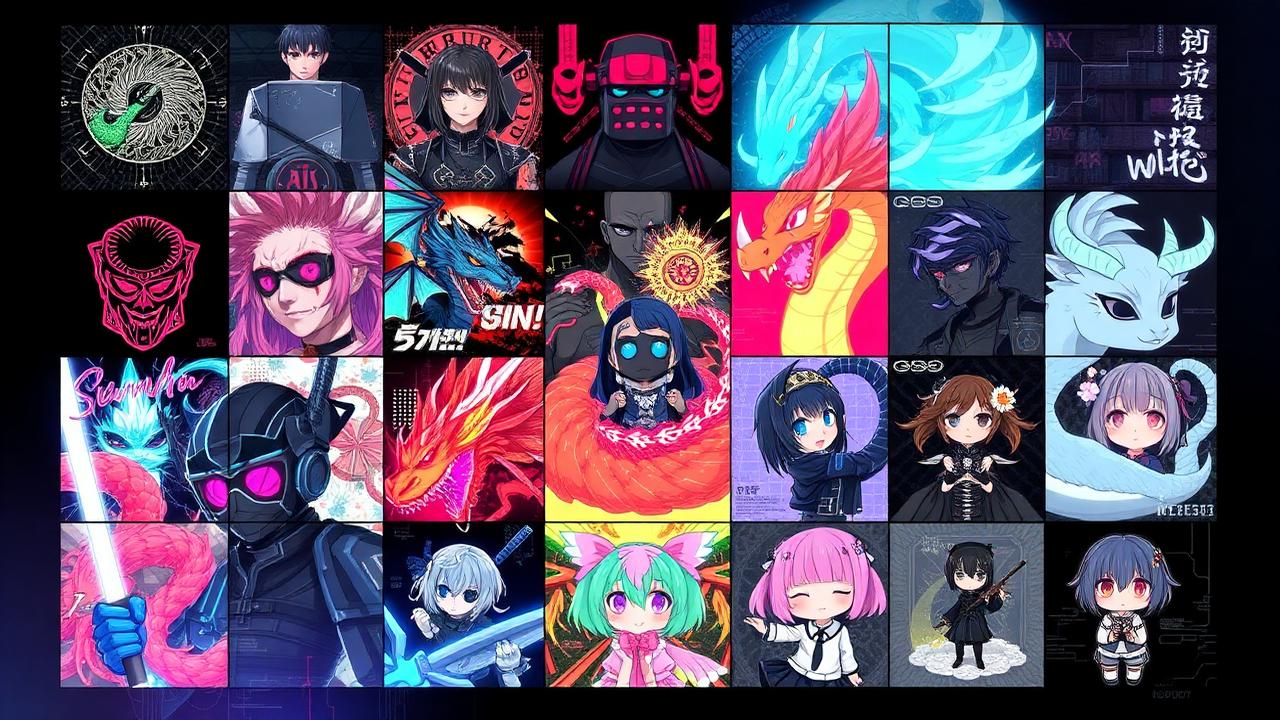
The hardest part of designing an AI mousepad isn't the tech — it's knowing what to type. A vague prompt gives you generic slop. A well-structured prompt gives you something worth printing at 1200×600mm.
Below are 25 battle-tested prompts organized by style, each with a one-line note on why it works. Copy any of them directly into the custom designer, or use them as templates for your own.
The formula every prompt follows
[Subject] + [Style] + [Composition hint] + [Color palette]
Stick to this structure and you'll get a print-ready result on the first or second roll about 90% of the time. Now the prompts.
Anime & character (1–5)
1. Bamboo forest samurai
"Lone samurai standing in a bamboo forest at dusk, ukiyo-e woodblock style, deep indigo and crimson palette, subject on the right third"
Why it works: Off-center composition keeps the mouse area clear. Ukiyo-e style prints beautifully at scale.
2. Neon Tokyo girl
"Cyberpunk anime girl with neon pink hair, rain-soaked Tokyo street, cinematic wide crop, blade runner lighting"
Why it works: Rain reflections add texture without busying the focal subject.
3. Crimson demon slayer
"Demon slayer in flowing red haori, moonlit cherry blossoms drifting across frame, traditional Japanese ink style, black and crimson palette"
Why it works: The drifting blossoms create natural motion across the wide canvas.
4. Retro mecha pilot
"Anime mecha pilot silhouette against a giant red sun, retro 80s anime aesthetic, grain texture, low contrast"
Why it works: Silhouettes print crisp at any size and never go out of style.
5. Cozy chibi scene
"Soft pastel chibi catgirl reading a book, cozy bedroom scene with warm window light, Studio Ghibli vibes, painterly texture"
Why it works: Soft palette photographs well in any room lighting.
Cyberpunk & futuristic (6–10)
6. Tokyo alleyway
"Neon-lit Tokyo alleyway at night, deep rain reflections on the asphalt, Blade Runner color palette, atmospheric mist, no people"
Why it works: No human subject means no awkward AI hands to worry about.
7. Synthwave motorcycle
"Lone figure on a motorcycle racing through a glowing tunnel, synthwave aesthetic, magenta and cyan, motion blur on the walls"
Why it works: Motion blur naturally guides the eye horizontally — perfect for XL pads.
8. Cyberpunk shrine
"Abandoned cyberpunk shrine overgrown with vines, pink and teal neon, atmospheric fog, low-angle cinematic shot"
Why it works: Contrast between organic decay and neon creates instant visual interest.
9. Server-tower dragon
"Holographic dragon coiled around a server tower in a dark data center, glowing pink scales, wide cinematic framing"
Why it works: Vertical subject in a wide frame leaves clean negative space for the mouse area.
10. Foggy katana samurai
"Futuristic samurai with a glowing plasma katana, foggy mountain backdrop, deep teal and electric blue palette, painterly style"
Why it works: Fog is the AI's best friend — it hides any background weirdness.
Minimalist & abstract (11–15)
11. Gold leaf brushstroke
"Single sweeping gold leaf brushstroke on matte black background, slight texture, painterly imperfection at the edges"
Why it works: Maximum impact with minimum noise. Looks expensive.
12. Topographic earth tones
"Topographic map contour lines in muted earth tones — clay, sand, sage — geometric composition with intentional asymmetry"
Why it works: Repeating patterns hide compression artifacts and print razor-sharp.
13. Sunset gradient
"Soft gradient from deep purple to warm peach, no subject, painterly canvas texture, slight grain"
Why it works: No focal point means nothing competes with the mouse and keyboard.
14. Concentric circles
"Three concentric circles in cream, sage, and terracotta on a linen texture background, Bauhaus-inspired composition"
Why it works: Geometric shapes are the most forgiving prompts an AI can handle.
15. Constellation map
"Constellation map of the northern sky on deep midnight blue, fine line work, subtle gold star points, no labels"
Why it works: Subtle enough to live with for years without getting bored.
Nature & atmospheric (16–20)
16. Misty pine forest
"Misty pine forest at dawn, soft watercolor style, muted greens and grey, light shafts breaking through canopy"
Why it works: Calming during long work sessions.
17. Aurora wolf
"Lone wolf silhouette on a snowy ridge under aurora borealis, deep teal and violet sky, painterly style"
Why it works: Aurora hides any sky weirdness while looking dramatic.
18. Underwater kelp
"Underwater kelp forest with shafts of sunlight filtering down, deep teal palette, small fish in the distance, painterly"
Why it works: Vertical light shafts give the eye somewhere to go on a wide canvas.
19. Desert dunes
"Desert dunes at golden hour, minimal composition with single ridgeline cutting across the frame, warm sand tones, no people"
Why it works: Minimalism scaled up to XXL feels meditative, not empty.
20. Hokusai wave
"Stormy ocean wave breaking, Hokusai-inspired but cinematic and modern, deep blue and white foam, subtle Mt. Fuji silhouette in distance"
Why it works: A timeless reference that prints well at any size.
Gaming & esports (21–25)
21. Arena overhead
"Stylized esports arena overhead view, dramatic stage lighting, blue and red team colors, motion lines suggesting action"
Why it works: Overhead perspective fills the wide aspect ratio naturally.
22. Stretched pixel landscape
"Pixel art landscape stretched into a cinematic widescreen format, retro RPG aesthetic, sunset palette, lone tower silhouette"
Why it works: Pixel art prints sharp and reads cleanly from any distance.
23. Mono speed lines
"Abstract speed lines exploding from a single focal point on the left third, monochrome black and white, high contrast"
Why it works: Energy and motion without color noise.
24. Neon arcade
"Glowing arcade cabinet in a dark room, 80s neon ambient lighting, slight CRT glow, retrofuturism, vibrant magenta and cyan"
Why it works: Single hero subject with rich ambient color does all the work.
25. Setup blueprint
"Topographic gaming setup blueprint laid out as a technical drawing, navy blue and cream palette, annotated like a vintage architectural plan"
Why it works: Technical drawing style is meta-perfect for a gaming surface.
How to get even better results
- Generate 2–3 times before tweaking the prompt — AI is cheap, your time isn't
- Push your subject off-center so the mouse area stays clean
- Limit your palette to 2–3 colors — busy = ugly at XXL scale
- Skip the adjectives ("amazing," "beautiful") and add composition cues instead
Keep going
Like this? Get the next one in your inbox.
New journal posts, prompt packs, and artist drops. No spam, ever.