
How to Design a Custom Deskmat: Full Walkthrough
July 5, 2026
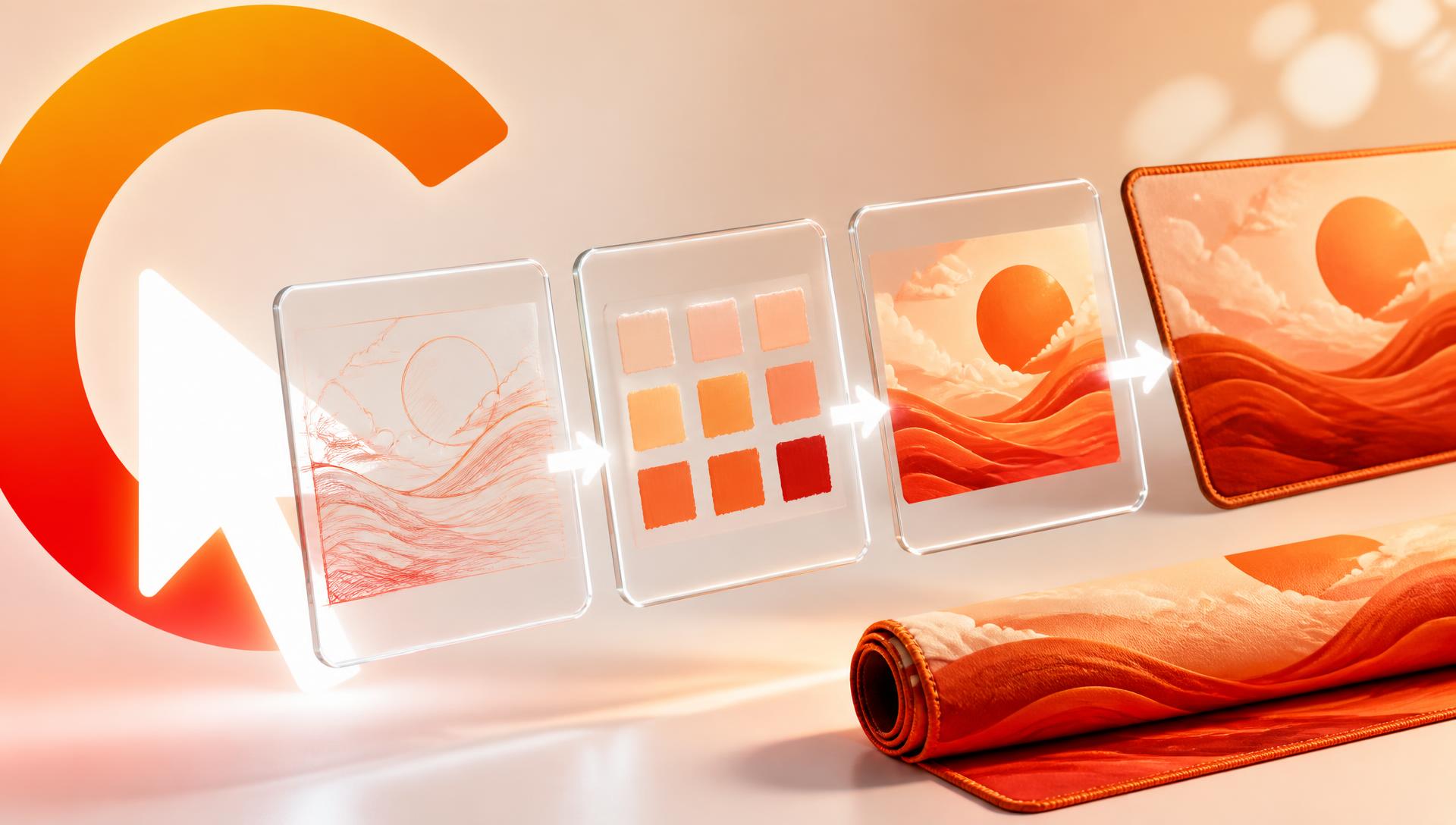
Designing a custom deskmat is a production problem wearing a creative costume. The art matters, but so do bleed, resolution, and where your hand actually sits — get those wrong and a great image becomes a mediocre pad. Here's the full path from blank canvas to a mat you'd actually keep for years.
This is the deskmat-specific version of the process: less about writing a clever prompt (that's covered in how to design a custom mouse pad with AI) and more about layout, print geometry, and the decisions that only matter once your canvas is 900mm or 1200mm wide.
Step 1: Pick the size before you design anything
A deskmat's size sets its aspect ratio, and aspect ratio is the single biggest constraint on composition. Decide this first or you'll be fighting the canvas the whole way through.
- XL — 800×300mm. Keyboard and mouse, most desks. A roughly 2.7:1 strip.
- XXL — 900×400mm. Full keyboard, mouse, and room to sweep at low DPI. Close to 2.25:1.
- XXXL — 1200×600mm. The entire desk surface, including monitor stand and peripherals. 2:1.
None of these are close to square, which is exactly why "just generate a nice image and crop it" fails. A composition built for a square subject gets its edges chopped off, or the subject ends up squeezed into a fifth of the pad with dead space everywhere else. Full breakdown of the three sizes and which fits which desk: XL vs XXL vs XXXL deskmat size guide.
Step 2: Understand bleed and the safe area
Every printed deskmat is cut slightly smaller than the file it's printed from, and every deskmat CursorCulture ships has a stitched perimeter. Both of those facts eat into your design.
Bleed is the margin of extra artwork beyond the final cut line. Print production always has a few millimetres of positional tolerance, so if your artwork stops exactly at the edge, you risk a thin sliver of unprinted material showing after trimming. Extend background elements — not important detail — a few millimetres past where the pad actually ends.
Safe area is the inverse problem: the zone just inside the edge where nothing critical should live, because it's about to disappear under the stitched border. That border runs roughly 6–8mm around the entire perimeter. A signature, a small character, fine text, or a face positioned right at the edge doesn't get gently obscured — it gets partially sewn over and permanently altered.
Practical rule: treat the outer 10mm as a "may vanish" zone and keep your actual hero content at least that far from every edge.
Step 3: Resolution at full-desk scale
A deskmat is viewed from about 60–70cm away, not held six inches from your face, so it doesn't need magazine-print resolution — but it does need to match its own size. A working target is 150 DPI at final physical dimensions:
| Size | Physical dimensions | Pixels needed at 150 DPI |
|---|---|---|
| XL | 800×300mm | ~4720 × 1770 |
| XXL | 900×400mm | ~5310 × 2360 |
| XXXL | 1200×600mm | ~7090 × 3540 |
The trap: a striking 1024×1024 AI generation is only about 170mm wide at that density. Stretched to fill a 900mm-wide XXL mat, every line softens and fine detail turns to mush. Generate at the size you need, or design with the studio's built-in canvas sizing so this is handled for you rather than guessed at after the fact. More on why this specific number matters and what happens when you ignore it: AI image quality explained.
Step 4: Compose for where your hands actually are
This is the part most people skip, and it's the difference between "nice picture" and "good deskmat."
The mouse zone. Your mouse spends most of its life in a rough arc on one side of the pad — usually the lower-right if you're right-handed, mirrored if you're not. Whatever sits there gets covered by your hand for hours a day and worn by direct friction. Put your least essential detail there — an open sky, a gradient, a calm wash of colour — not your character's face.
The keyboard occlusion zone. On XL, XXL, and XXXL mats, a keyboard sits somewhere on the pad, usually left-of-centre or centred. Everything under it is invisible day to day. If your composition's strongest detail is dead centre, half of it disappears under your keyboard the moment you set it up. Push your focal point toward one of the ends instead.
The visible band. What's left — the strip behind and around the keyboard, plus whichever side isn't buried under your mouse hand — is what you and everyone else actually sees. Put your hero subject there.
A reliable layout for any of the three sizes: anchor your subject in the left or right third, let it fill roughly a third to a half of the width, and let the remaining space breathe as atmosphere, gradient, or negative space rather than competing detail.
Step 5: Choose colours that survive sublimation
Deskmats are dye-sublimation printed onto polyester cloth, not inkjet-printed. That process bonds colour into the fibres rather than laying ink on top, which is why it doesn't peel or crack — but it also has a real gamut limit compared to a backlit screen.
- Electric cyans, fluorescent limes, and neon magentas compress toward the nearest colour the fabric can actually hold.
- Deep, rich tones — indigo, umber, moss, burnt orange, off-white — reproduce close to what you see on screen.
- Large flat black fields print as a very deep near-black but show dust, lint, and handling marks more visibly than a mid-tone or subtle gradient would.
None of this means avoid saturation. It means avoid maximum saturation. A restrained, three-colour palette almost always looks more premium at full-desk scale than an aggressively neon one, and it prints far more predictably.
Step 6: Keep text legible or skip it
Small generated text on a deskmat is a liability twice over: AI models are unreliable at rendering legible text, and even correct text shrinks to illegibility once it's part of a 900mm-wide composition rather than a screen-sized image. If you want a logo, initials, or a phrase, keep it large, simple, high-contrast, and well clear of the safe-area margin — or leave text out entirely and let the imagery carry the design.
Step 7: Generate and refine in the studio
Once you know your size, safe area, and rough composition, open the studio and start generating. Describe the subject, style, mood, and where you want the eye to land, then look at the result on the actual pad mockup — not as a floating square image. Refine one thing at a time: composition first, then palette, then detail density. This iterative process is covered in depth in how to design a custom mouse pad with AI, and if you want to skip prompting entirely and start from an uploaded reference or photo, see design your own mousepad with no Photoshop.
Step 8: Proof before you order
Before checkout, run through this check on the mockup at your actual size:
- Is anything essential inside the 6–8mm stitched border? Move it in.
- Is your strongest detail sitting where a keyboard will cover it? Shift it toward an end.
- Is anything in the mouse-hand zone that you'll never actually see again? Simplify it.
- Are there fluorescent colours you can't afford to lose in print? Deepen them.
- Is there any generated text? Read every character twice.
Design pitfalls vs fixes
| Pitfall | Why it happens | Fix |
|---|---|---|
| Subject vanishes at the edge | No safe-area margin left for the stitched border | Keep hero content 10mm+ from every edge |
| Blurry print at full size | Generated small, then stretched to fit the pad | Generate at or near the pixel target for your size |
| Best detail hidden under the keyboard | Subject placed dead centre | Anchor the focal point in the left or right third |
| Colours look duller than on screen | Neon/fluorescent tones exceed sublimation's gamut | Use deep, rich tones instead of maximum saturation |
| Design feels busy at full-desk scale | Too many competing focal elements | One hero subject, generous negative space |
| Text is unreadable once printed | Small generated text shrinks further at physical scale | Go large and simple, or skip text |
| Pad shifts attention away from your hands | No thought given to the mouse-zone | Put calm, low-detail content where your hand rests |
FAQ
What size deskmat should I design for?
Measure your desk first. XL (800×300mm) suits most keyboard-and-mouse setups, XXL (900×400mm) adds room for wide low-DPI swipes, and XXXL (1200×600mm) covers a full desk including peripherals. Pick the size before generating artwork, since it fixes the aspect ratio.
What is bleed and do I need to add it myself?
Bleed is a small margin of extra background beyond the final cut line, added so minor cutting tolerance doesn't leave an unprinted sliver at the edge. When you design in the studio at the correct canvas size, this is handled for you.
How much of the edge disappears under stitching?
Roughly 6–8mm around the entire perimeter. Keep any subject you care about, including signatures or small text, further in than that.
What resolution does a deskmat design need?
About 150 DPI at final physical size — for example, roughly 5310×2360 pixels for a 900×400mm XXL mat. Generating below that and stretching up will visibly soften detail.
Why do my colours look different once printed?
Deskmats are dye-sublimation printed, which has a narrower colour gamut than a backlit monitor, especially for neon and fluorescent shades. Deep, restrained tones reproduce far more accurately than maximum-saturation colours.
Should I put my keyboard's outline into the design?
No. Keyboard position varies by user and desk, so don't design around one specific outline. Instead, keep your strongest detail toward one end of the mat so it stays visible regardless of exactly where the keyboard lands.
Can I put text or a logo on my deskmat?
You can, but keep it large, high-contrast, and well inside the safe area. Small or fine text is unreliable to generate accurately and becomes illegible once scaled to desk size.
Design yours now
You don't need a design background to get this right — you need the size decided, the safe area respected, and one clear subject placed where it'll actually be seen. Head to the studio, pick your size, and start generating; check pricing once you've landed on a design you want to keep.
Keep going
Like this? Get the next one in your inbox.
New journal posts, prompt packs, and artist drops. No spam, ever.